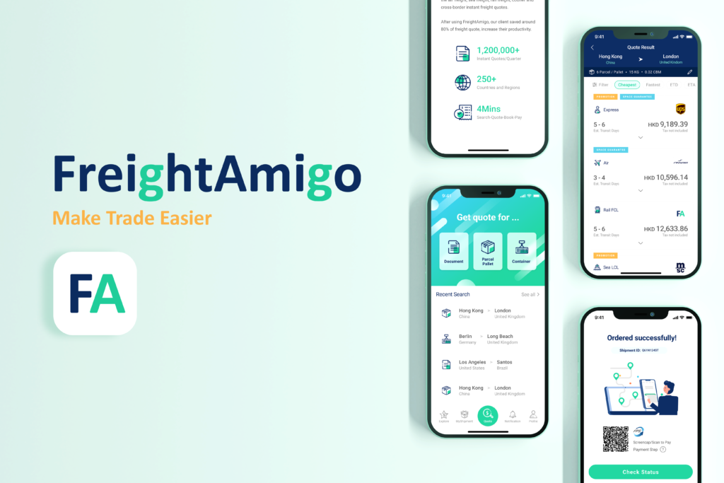
FreightAmigo is a logistic start-up which provides smart and economic logistic solutions to business and retail clients. They want to revamp the mobile app and enhance the experience with updated branding style.
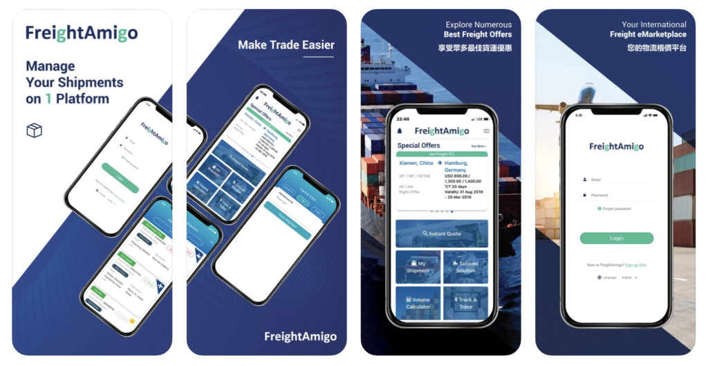
Original design preview in App Store
Challenge
Inconsistent design style and use of colours
The original design is immature that most of the components are based on several the development libraries, which makes the design style and colours inconsistent
Customers feel confused on messy contents
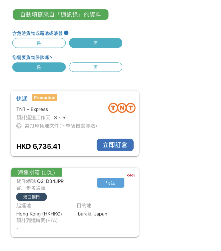
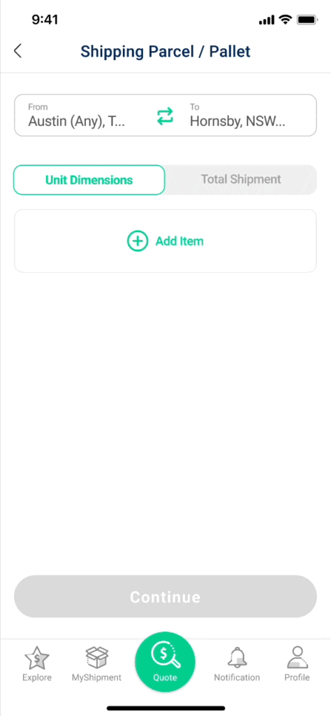
An accurate quote requires customers provide much information. The original design place all of the fields in the same page with little spacing between each fields and sections. Which makes the page messy and wordy.
Lack of organisation on information and navigation
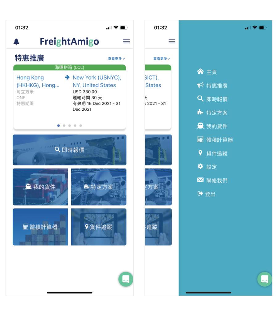
Home page is like a menu panel, showing a lot of links. And inside the long menu list, which includes same links plus more. Precious space on home page shouldn’t just for placing links but have meaningful content.
Tags and CTAs are in different styles and colours
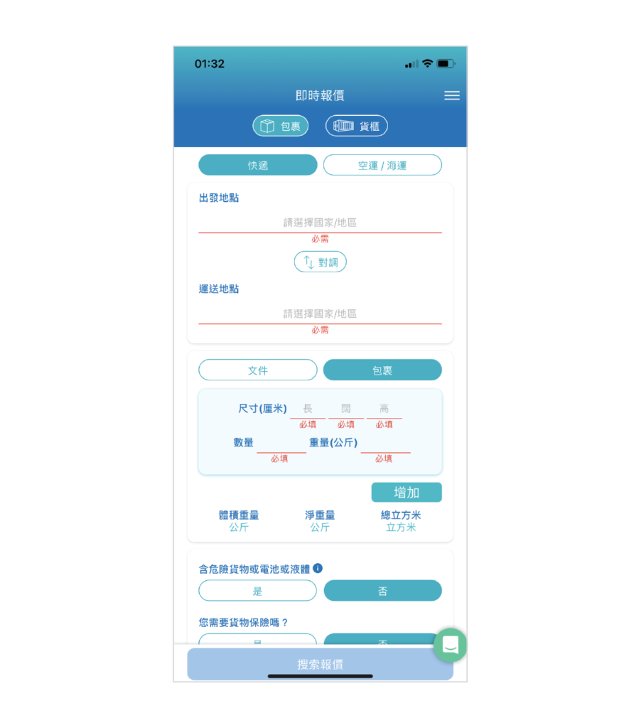
All fields in the same page
Home page and the side menu
Improve the User Experience
1. Let user focus on the task
All content used to put into the same page, which makes it crowded and messy.
After redesigning the whole input journey, the form are divided into different steps, so users can focus on the task, fill in all info step by step. This helps to increase the incentive as well.
2. Clearer navigation
It’s very common to have bottom navigation bar for easy access to major functions. Quote is the most popular function in the app, so we set it to be prominent.
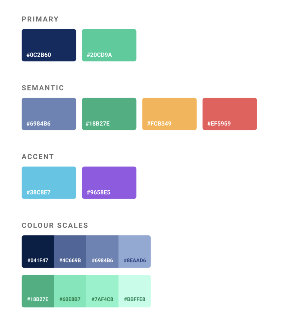
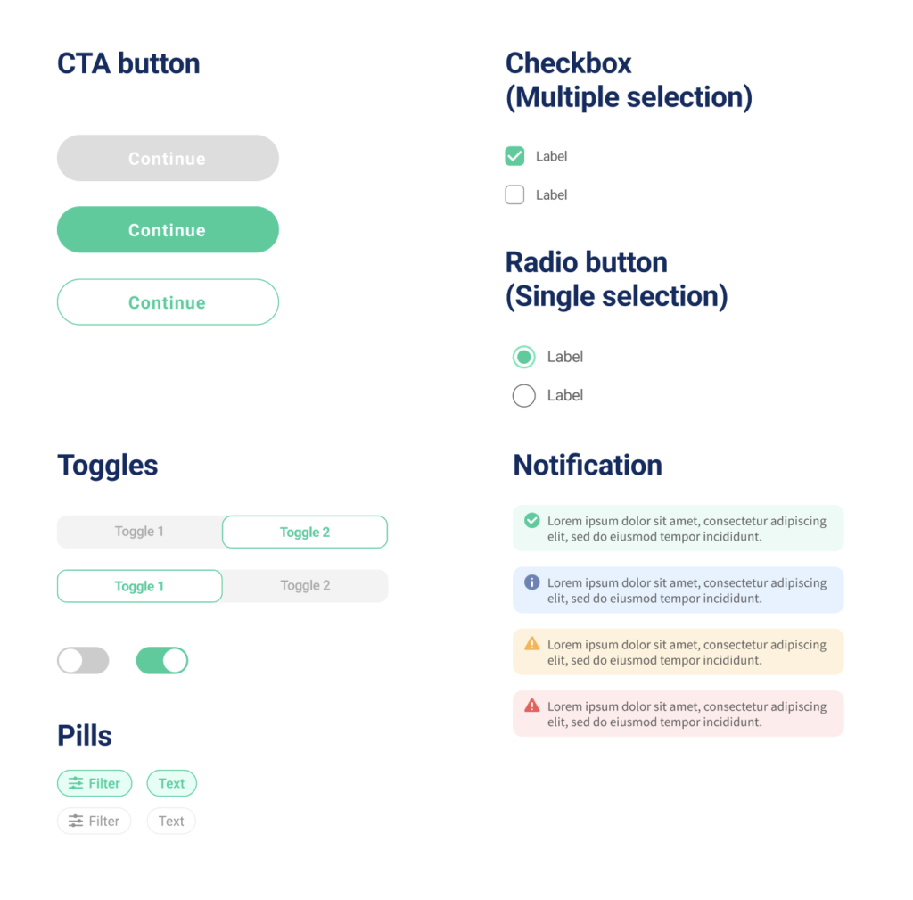
3. Redefine the colours
Several iterations helped us find the right number of colors and shades.
There are 3 types of colors:
Primary – the dominant color that the user sees most in our product.
Semantic – error, success, warning, information. These colors are based on very firm research about the psychology of signals.
Accent – colors that are used to emphasize some UI elements, or to highlight some information.
4. Use colour in the right way to reduce confusion
After we defined the colours in Primary, Semantic and Accent, the colour usage on each of the components is more rational. Users won’t see CTAs with different colours anymore. App is a tool, not a colourful artwork. Clear UI helps users to finish their task easier and quicker.
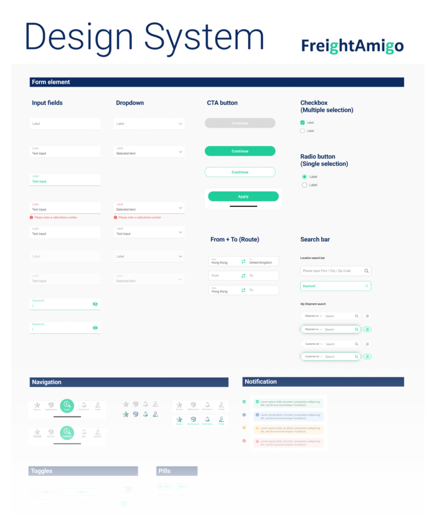
Design system
More functions and ideas are going to add on the Omnichannel in FreightAmigo. The company thus, want to develop a scalable and sustainable design system to fit their rapid business grow.